For this project I designed a “series” of three books by author Ray Bradbury. The chosen books were Fahrenheit 451, The Martian Chronicles, and Death is a Lonely Business. Though not a series of consecutive stories, these three books all contain similar themes of dystopian futures and the consequences of American arrogance and imperialism. For this cover series the goal was to portray these themes in a typographic manner with the large scale type giving a sense of impending doom and an overbearing government. This feeling is driven home by the regulatory label which contains the titles, author’s name, a short description, and a small icon which captures an element from each book.
.
DESIGNING DYSTOPIA
Book Design, Publication Design
This project was featured by BountyHunters, a company which highlights and promotes works of great design on social media and their website; linked HERE


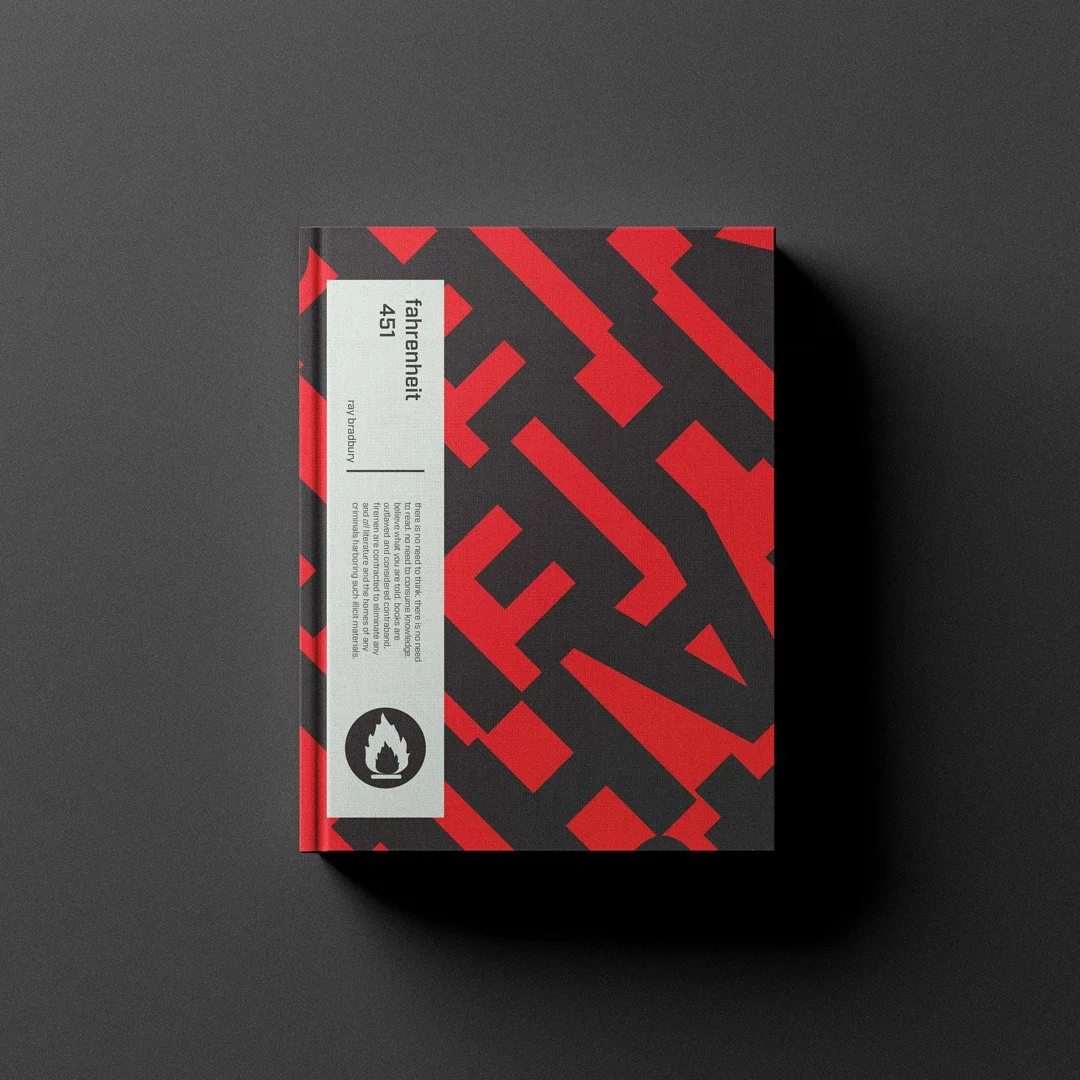


This project presented a unique challenge to connect three vastly different stories visually. I experimented with differents ways to display the themes present in this novels. Testing out ideas using portraiture, texture, and type, among others. I ultimately chose to develop expressive typography for each book cover. Using the font choices and angles of the type to differentiate each story but to maintain that these three covers are a set.


The covers for Fahrenheit 451 and Death is a Lonely Business I was able to use existing typefaces I felt accurately captured the feeling of the novels. For The Martian Chronicles I felt I needed something more unique which could reflect the strange and alien environments of the book. To achieve this I created my own version of Jonathan Hoefler’s “Gestalt.”
By repeating and rotating this title wordmark I created the pattern of type seen on the final cover.